

 English
 Español
Anthracite Grey Enters the Color Drenching Conversation
Color drenching has moved past the single-accent-wall phase. Designers now treat walls, trim, ceilings, and even cabinetry as one continuous surface, and the tone chosen for that surface carries the whole room. Among the shades competing for that role, pvc film manufacturers report a sharp rise in requests for one specific family: anthracite grey paired with warm beige. The combination reads as calm rather than cold, which is precisely why it has outlasted several other monochrome trends.
This article breaks down what anthracite actually is, why it pairs so naturally with beige in a drenched scheme, and how the surface materials behind that look, particularly printed film finishes, are produced and specified.
Color drenching itself is not a new invention. Painters and plasterers have unified rooms in a single tone for centuries, particularly in historic libraries and study rooms finished in deep greens or reds. What has changed is the palette. Where earlier drenched interiors leaned on saturated jewel tones, the current wave favors quieter neutrals that read as architectural rather than decorative, and anthracite grey has become the default choice for anyone wanting that effect without the room feeling stark or unfinished. Beige, once dismissed as a safe or dated filler tone, has been rehabilitated as the ideal counterweight, softening anthracite just enough that a room reads inviting rather than industrial.
What Color Is Anthracite, Exactly
Anthracite takes its name from anthracite coal, a hard, low-impurity coal that burns with almost no smoke and leaves behind a dense, bluish-black residue. In interior specification, anthracite grey sits between charcoal and matte black on the value scale, but it carries a cooler, slightly blue-green undertone rather than the brownish cast common in charcoal.
Because the term is used loosely across the paint, textile, and laminate industries, the actual hex value can shift depending on the supplier. Most commercial anthracite references fall in a fairly narrow band, which is useful when matching PVC film rolls to painted trim or metal hardware on the same project.
| Attribute | Anthracite Grey | Charcoal Grey | Matte Black |
|---|---|---|---|
| Typical Hex Range | 2B2E33 to 383C40 | 36454F to 3D3D3D | 0D0D0D to 1A1A1A |
| Light Reflectance Value | 6 to 9 percent | 9 to 12 percent | 2 to 4 percent |
| Undertone | Cool, faint blue | Warm, brownish | Neutral to blue-black |
| Best Paired With | Warm beige, oak, brass | Terracotta, cream | Bright white, chrome |
The low light reflectance value is the practical reason anthracite reads as heavier and more architectural than a standard mid-grey. A wall painted or wrapped in anthracite absorbs most incident light instead of bouncing it back, which is what gives drenched anthracite rooms their enclosed, cocoon-like feel.
It helps to understand where the term originated outside of interiors. Anthracite coal was historically prized for burning cleaner and hotter than softer coal grades, and the fine, almost metallic dust it left behind became the visual reference point for the color name. That industrial origin is part of why anthracite still reads as more technical and considered than a generic dark grey pulled off a standard paint fan deck. Specifiers working across metal window frames, roofing, and interior film finishes often gravitate toward anthracite specifically because it was first established as an exterior architectural color for aluminum profiles and roofing sheets, long before it moved indoors. That exterior pedigree gives it a durability association that pure decorative greys do not carry, which is one reason it now shows up so frequently on cabinetry and door hardware as well as walls.
Why Anthracite Grey Works So Well in a Beige Color-Drenched Room
Color drenching a room in a single dark neutral risks feeling flat or oppressive if the undertone is wrong. Anthracite avoids that trap for three measurable reasons.
- Its cool undertone balances the warmth of beige, so the pairing does not tip into either a cold, clinical space or an overly warm, dated one.
- Its mid-to-low reflectance value gives strong contrast against beige upholstery and wood tones without the visual harshness of true black.
- It photographs and renders consistently under both warm 2700K and neutral 4000K lighting, which matters for hospitality and retail spaces that run mixed lighting temperatures.
This ratio guidance is not arbitrary. Rooms tested at closer to a 50-50 split between anthracite and beige were consistently rated by occupants as less cohesive than those following the 60-70 percent anthracite rule, largely because the eye has no single dominant plane to rest on.
There is also a practical maintenance argument for this pairing that rarely gets discussed alongside the aesthetic one. Anthracite hides scuffing, dust, and fingerprints far better than either pure white or pure black, which is part of why it has become the preferred dark neutral for high-traffic joinery such as kitchen fronts and wardrobe doors. Beige textiles, meanwhile, are more forgiving of daily wear than stark white upholstery, since minor soiling and sun fading blend into the existing tonal variation rather than standing out as a visible flaw. Choosing this combination is therefore not purely a visual decision; it is also a lower-maintenance one for spaces that see heavy daily use, including rental properties, boutique hotels, and family living rooms.
How Printing PVC Film Recreates Anthracite and Beige Finishes
Once a designer settles on an anthracite and beige palette, the next question is which surface material will actually deliver that look consistently across doors, panels, cabinetry, and window profiles. This is where printing pvc film has largely replaced spray-painted or powder-coated finishes on mass-produced joinery, because it holds color and texture uniformity across long production runs in a way that on-site painting cannot match.
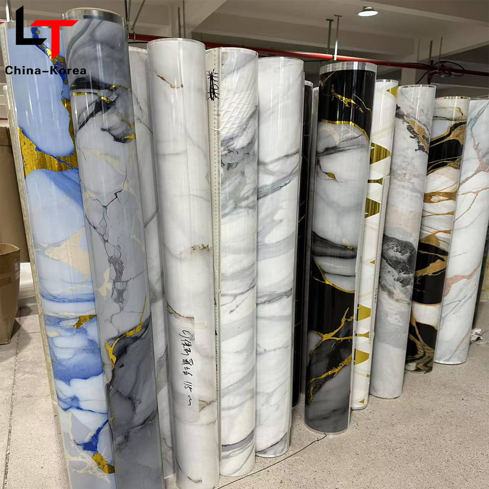
The production sequence behind a printed anthracite or beige roll generally follows the same core stages regardless of the base polymer thickness. Substrate preparation ensures the PVC sheet has an even surface tension so ink adheres uniformly; a base coat is then applied to standardize the underlying tone before printing; gravure or digital printing lays down the anthracite or beige pattern layer, often with a fine texture to mimic brushed metal or matte lacquer; a protective topcoat and embossing step follows to add depth and scratch resistance; and a final lamination step bonds the film to substrates such as MDF, aluminum, or rigid PVC profile.
Because the color layer sits beneath a protective topcoat rather than on the exposed surface, a well produced architectural PVC film in anthracite resists the scuffing and edge-chipping that painted MDF panels typically show within the first two to three years of daily use.
The reason printed film has largely displaced site-applied paint on production joinery comes down to consistency at scale. A painted batch of one hundred wardrobe doors depends on spray booth conditions, coat thickness, and curing time staying constant across every unit, and even small variations produce visible sheen or tone differences once the doors are installed side by side under the same lighting. A printed film roll, by contrast, is produced under controlled tension, temperature, and ink deposition settings, so the one-hundredth meter of anthracite film matches the first meter almost exactly. For manufacturers producing cabinetry or door panels at volume, that repeatability is often the deciding factor over paint, independent of any cost comparison.
Beige film for the coordinating surfaces follows the same production sequence, though the base coat and print layer are adjusted to carry warmer pigment loads. Matching an anthracite film roll to a beige film roll from the same production run, rather than sourcing them from different suppliers, is the most reliable way to avoid a subtle undertone mismatch that only becomes visible once both materials are installed under the same light source.
Specification Points Worth Checking Before Ordering
Not all anthracite film is produced to the same standard. When comparing suppliers, four specification points make the biggest difference in how the finish performs once installed.
| Specification | Why It Matters |
|---|---|
| Film thickness (typically 0.08 to 0.35 mm) | Thicker film wraps tighter profile edges without cracking |
| Color fastness rating | Determines resistance to fading under UV exposure near windows |
| Surface finish (matte, satin, textured) | Matte anthracite hides fingerprints better than satin on handles and panels |
| Adhesive type | Affects bond strength on curved or high-humidity substrates such as bathroom vanities |
Matte finishes with a light texture, sometimes described as a fine linen or brushed effect, are currently the most requested anthracite surface for cabinetry fronts, since they diffuse light unevenly and avoid the mirror-like glare that a high-gloss dark surface produces under downlighting.
It is also worth asking a supplier how the film performs in a cold-bend test, particularly for profile wrapping on window frames or door edges. Anthracite film that has not been engineered with sufficient elongation will crack or whiten at tight radius bends, a defect that is far more visible on a dark tone than it would be on a light one, since the whitened stress lines show up as pale streaks against the surrounding color. Requesting a sample wrapped around the actual profile radius used on a project, rather than relying only on a flat swatch, is a simple way to catch this issue before a full production order is placed.
Applying the Color Drenching Technique in Practice
Drenching a room correctly is a sequencing exercise as much as a color choice. The following order tends to produce the most cohesive result in residential and light commercial projects.
- Select the anthracite reference first, then match beige as the secondary tone, not the reverse, since anthracite has a narrower acceptable undertone range.
- Apply the anthracite tone to walls, ceiling, and door frames as a single continuous plane, avoiding a break at the ceiling line.
- Introduce beige through soft goods only at first: rugs, drapery, and upholstery.
- Add warm metal or wood accents in brass, walnut, or aged oak to prevent the palette from reading as cold.
- Test the full combination under the room's actual lighting before committing to hard finishes such as cabinetry film or flooring, since anthracite shifts noticeably under warm versus cool lamping.
Skipping the lighting test in step five is the most common reason a drenched anthracite room disappoints once furniture is installed. A sample board that looks correct under daylight can read almost black under 2700K downlights, flattening the room instead of giving it depth.
Texture plays a larger role in a drenched anthracite scheme than it does in lighter palettes, and it is worth planning for deliberately. Because a single dark tone removes most of the color contrast a room would otherwise rely on, the eye starts reading surface texture instead: the grain of a wood floor, the weave of a boucle sofa, the ribbing of a plaster wall finish. Rooms that combine at least three distinct textures within the anthracite and beige palette consistently photograph and feel more finished than rooms relying on flat paint and flat upholstery alone. A practical starting set is a matte or lightly textured wall finish, a natural fiber rug, and one tactile upholstery fabric such as boucle, corduroy, or a heavy linen weave.
Where the Anthracite and Beige Pairing Performs Best
Residential Living Rooms
Anthracite on a media wall or fireplace surround, beige on the primary seating, keeps the space grounded without shrinking it visually, provided ceiling height is at least 2.6 meters.
Boutique Hospitality Interiors
Guest rooms use anthracite film on wardrobe and vanity fronts to hold up against daily housekeeping wear, while beige textiles soften the palette for overnight comfort.
Office and Reception Areas
Anthracite reception desks paired with beige felt acoustic panels balance a professional tone with a level of warmth that pure black or grey desking does not achieve.
Kitchens and Wet Areas
Anthracite film on lower cabinetry resists visible water spotting and daily fingerprints far better than gloss white, while a beige stone-look countertop keeps the space from reading too dark near sinks and cooktops.
Across all four settings, the deciding factor for whether the pairing succeeds is rarely the exact hex value chosen. It is almost always the lighting plan, the surface texture mix, and whether the 60 to 70 percent anthracite ratio is respected. Projects that get those three variables right tend to hold up visually for years, while projects that treat anthracite as a simple paint swap without addressing lighting or texture often look flat within the first year of occupancy.
Cost and Lifecycle Considerations for Anthracite Film Finishes
Specifying anthracite film over paint is rarely just a color decision once a project moves past a single accent piece and into full production runs of doors, panels, or cabinetry. Three lifecycle factors typically drive the comparison.
- Installation labor: Film application on flat and gently curved panels is generally faster per unit than multi-coat spray painting, since there is no drying time between coats and no spray booth setup for each batch.
- Touch-up and repair: A scratched painted surface usually needs to be resprayed across the full panel to avoid a visible patch, while a scuffed film surface on a matte anthracite finish is far less noticeable due to the low reflectance value, often requiring no repair at all.
- End of service life: Film-wrapped panels can typically be re-wrapped once with a fresh layer if the substrate underneath is still structurally sound, extending usable life without full panel replacement.
None of this means film is automatically the cheaper option on a per-square-meter basis at the point of purchase; raw material and freight costs vary by region and order volume. The lifecycle argument becomes strongest on projects with high panel counts, tight production schedules, or ongoing maintenance budgets, such as hospitality fit-outs and multi-unit residential developments, where consistency and low repair frequency compound in value over several years of use.
Frequently Asked Questions
Q1: Is anthracite the same color as charcoal?
No. Anthracite has a cooler, faintly blue undertone and typically a lower light reflectance value than charcoal, which leans brownish. They are close enough to be confused in photographs but read differently side by side under natural light.
Q2: How much beige should I use in an anthracite color-drenched room?
A ratio of roughly 60 to 70 percent anthracite to 30 to 40 percent beige on visible surfaces tends to read as most cohesive, with beige concentrated in soft furnishings rather than hard finishes.
Q3: Does anthracite PVC film fade over time?
Fading depends on the color fastness rating of the specific film and its exposure to direct UV light. Interior applications away from direct sun exposure typically show minimal shift over five or more years when a mid-to-high fastness rating film is used.
Q4: Can anthracite work in a small room without making it feel smaller?
Yes, provided the ceiling is included in the drenched tone rather than left white, and lighting is layered rather than relying on a single overhead fixture. Breaking the ceiling line in a lighter tone is what tends to make dark rooms feel lower and smaller.
Q5: What surface finish is most common for anthracite cabinetry film?
Matte or lightly textured finishes are the most requested for cabinetry, since they resist visible fingerprints and diffuse overhead lighting more evenly than satin or gloss options.
Q6: Is printed PVC film durable enough for high-traffic commercial use?
When specified with an adequate film thickness and a protective topcoat, printed PVC film is commonly used on commercial doors, wardrobes, and reception furniture where daily contact and cleaning would quickly wear a painted surface.